Anime Colour Grading
Experimenting with Lightroom's colour editing
Anime backgrounds tend to be these beautiful, coloured backdrops that have this hyper-realistic quality to them. One particular style brought by artist/animator/director Makoto Shinkai, are particularly impressive, with his films such as 5 Centimeters per Second and Your Name both showing landscapes in a truly impressive way.

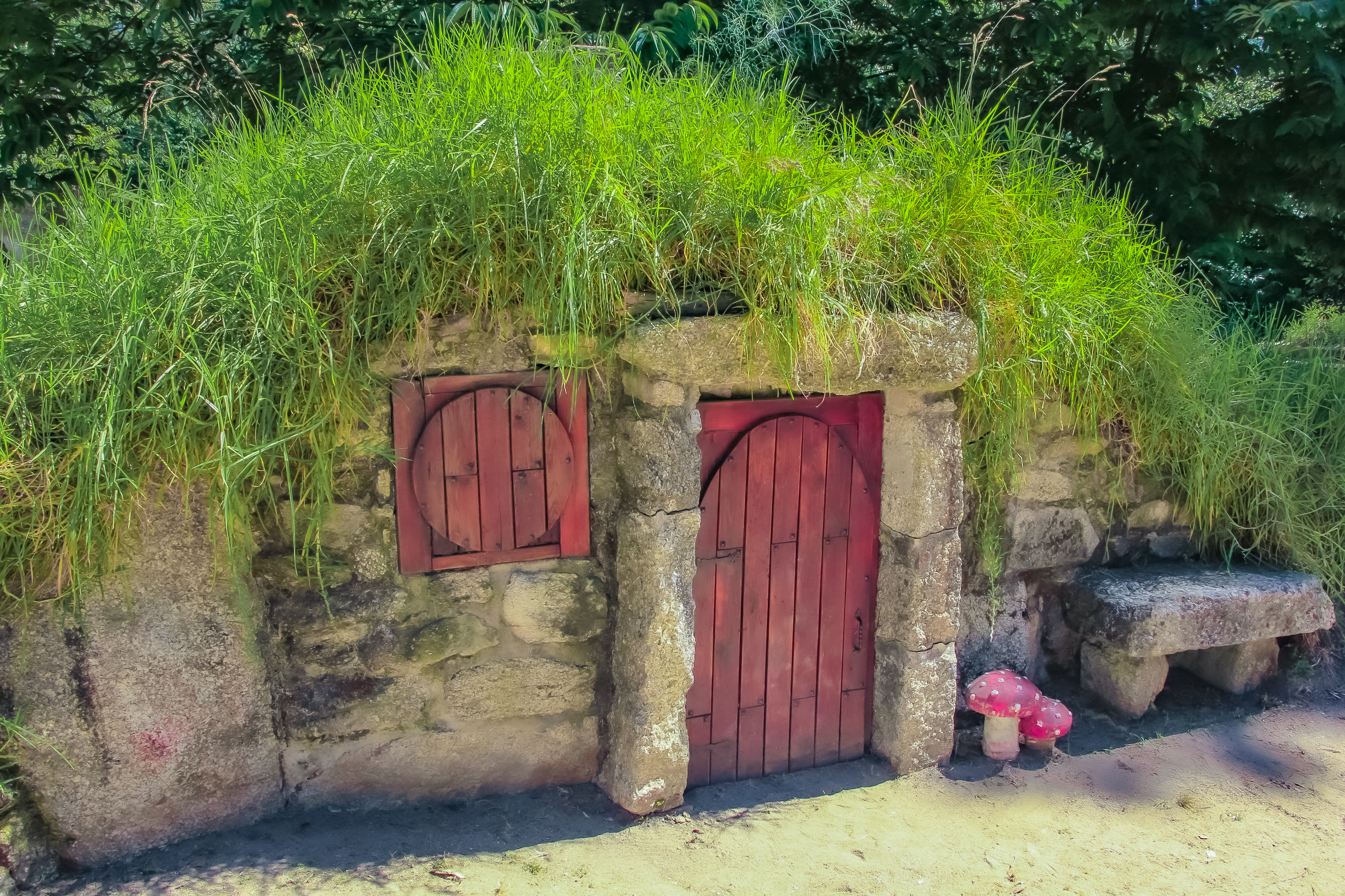
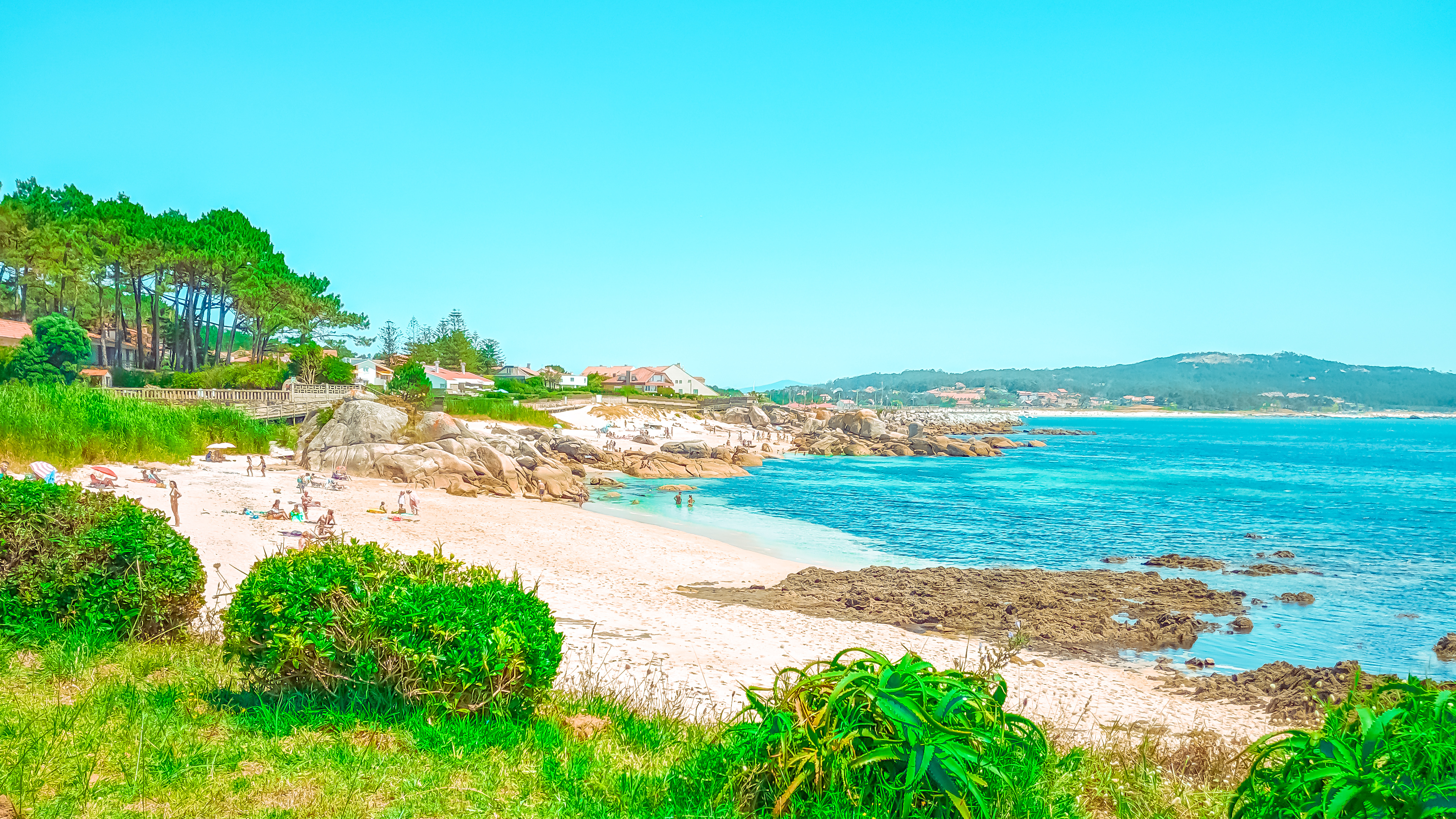
There’s also Miyazaki’s Studio Ghibli, whose films such as My Neighbor Totoro, Spirited Away and Howl’s Moving Castle all feature iconic grass plains, lush forests and expansive coastlines.


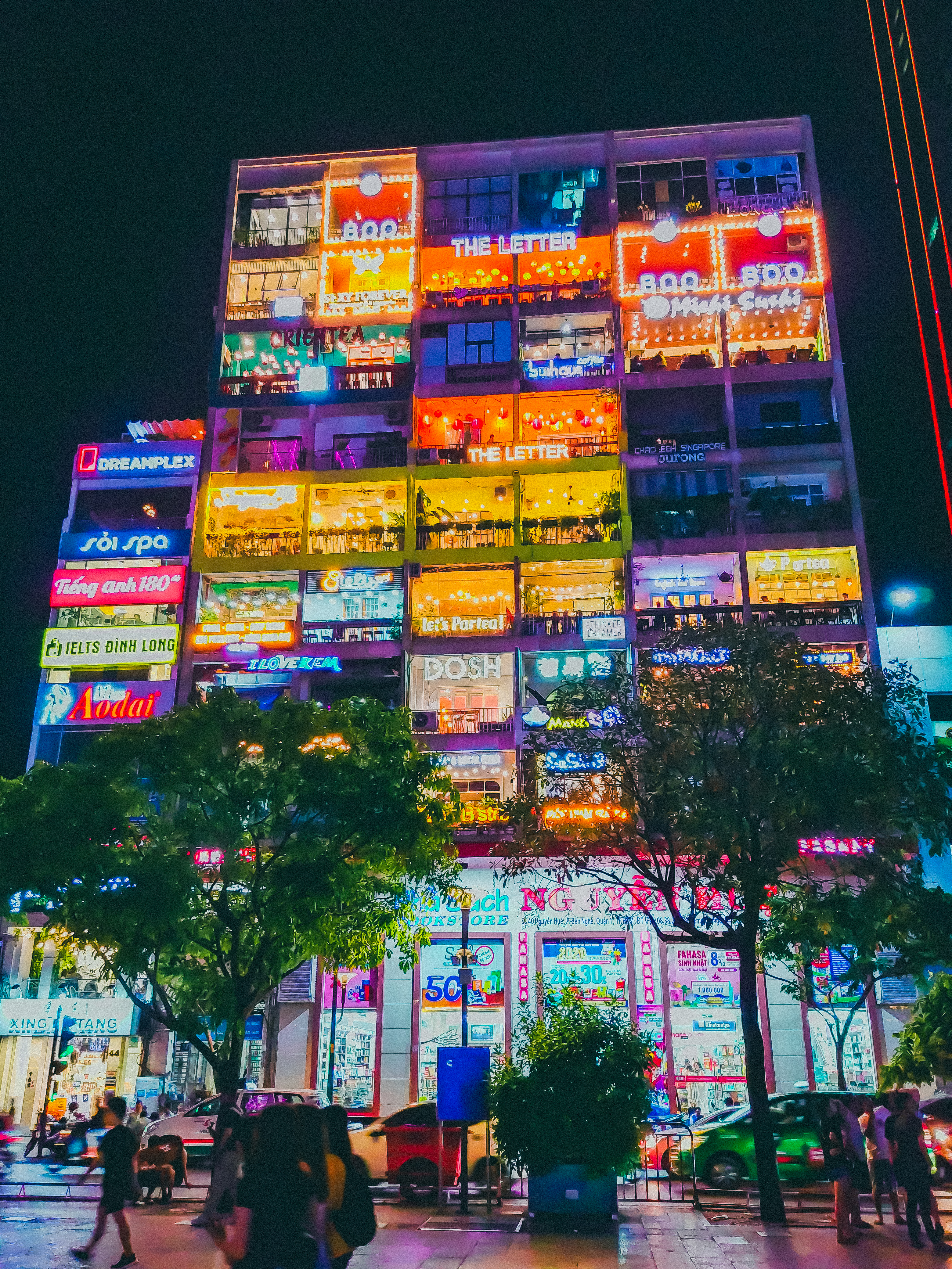
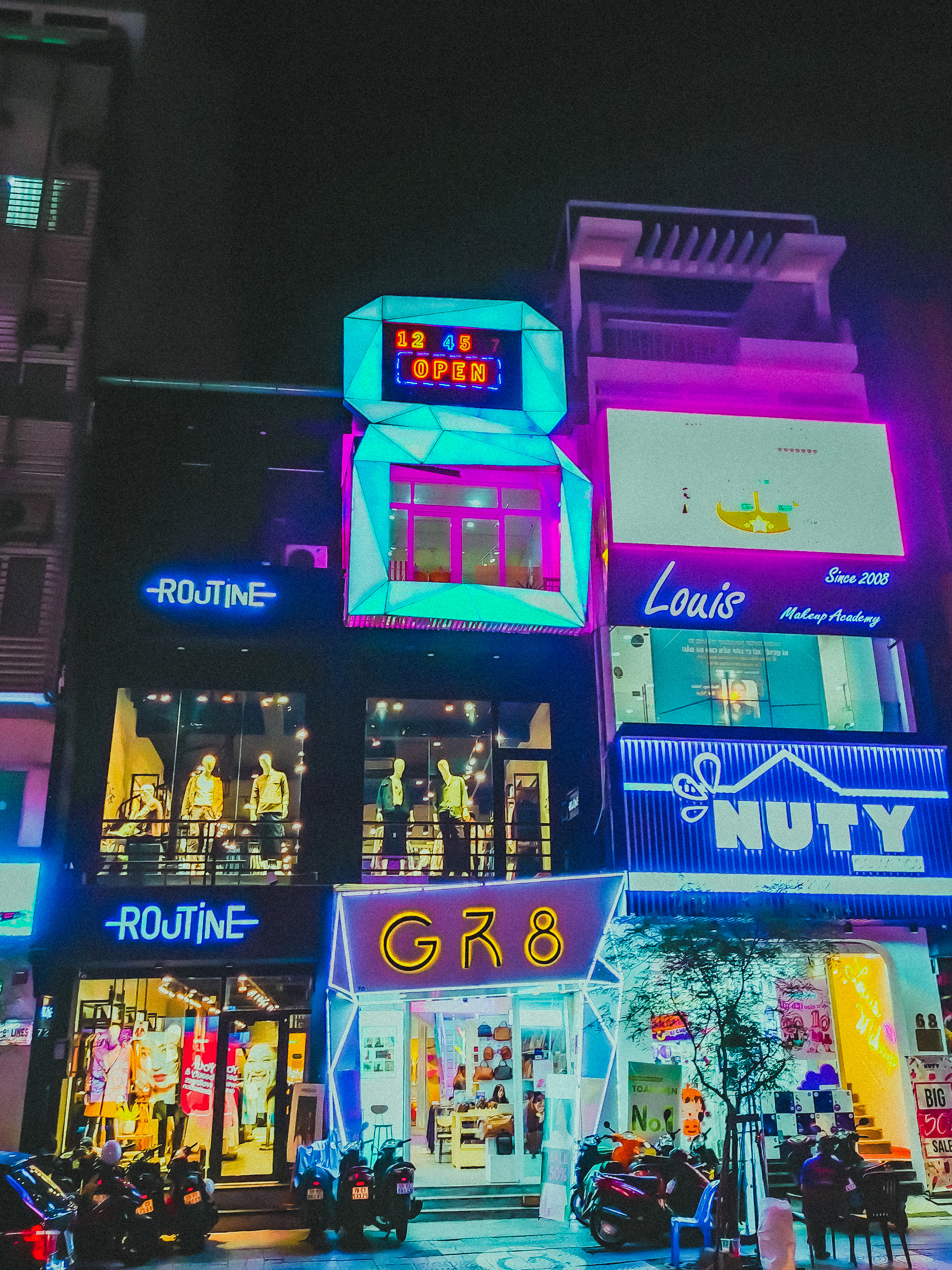
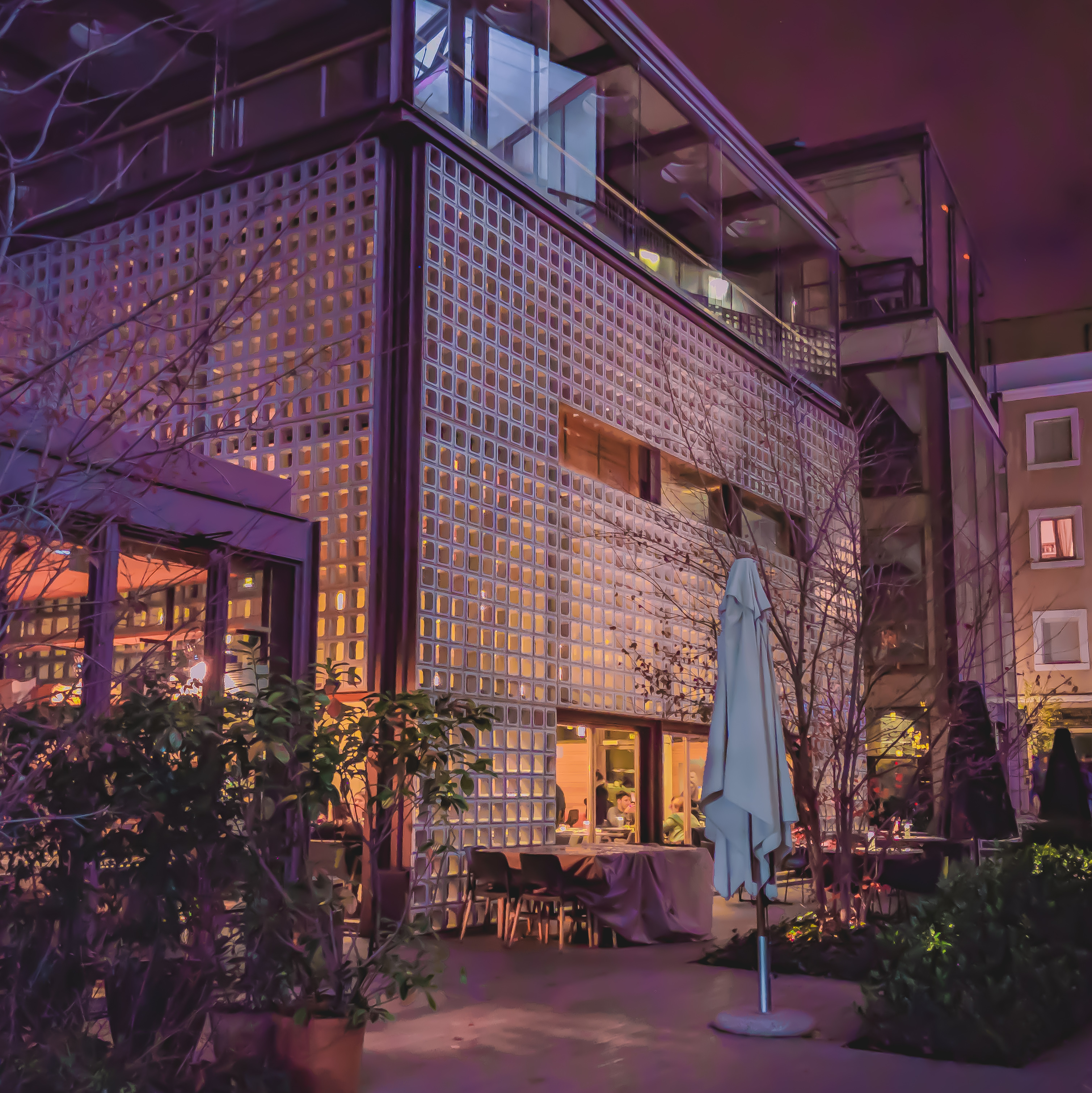
Finally there’s the neon side of things, with Ghost in the Shell, Akira and Cowboy Bebop, all of which tend to take a cue from Bladerunner, showing tight cities, in all of their neon .

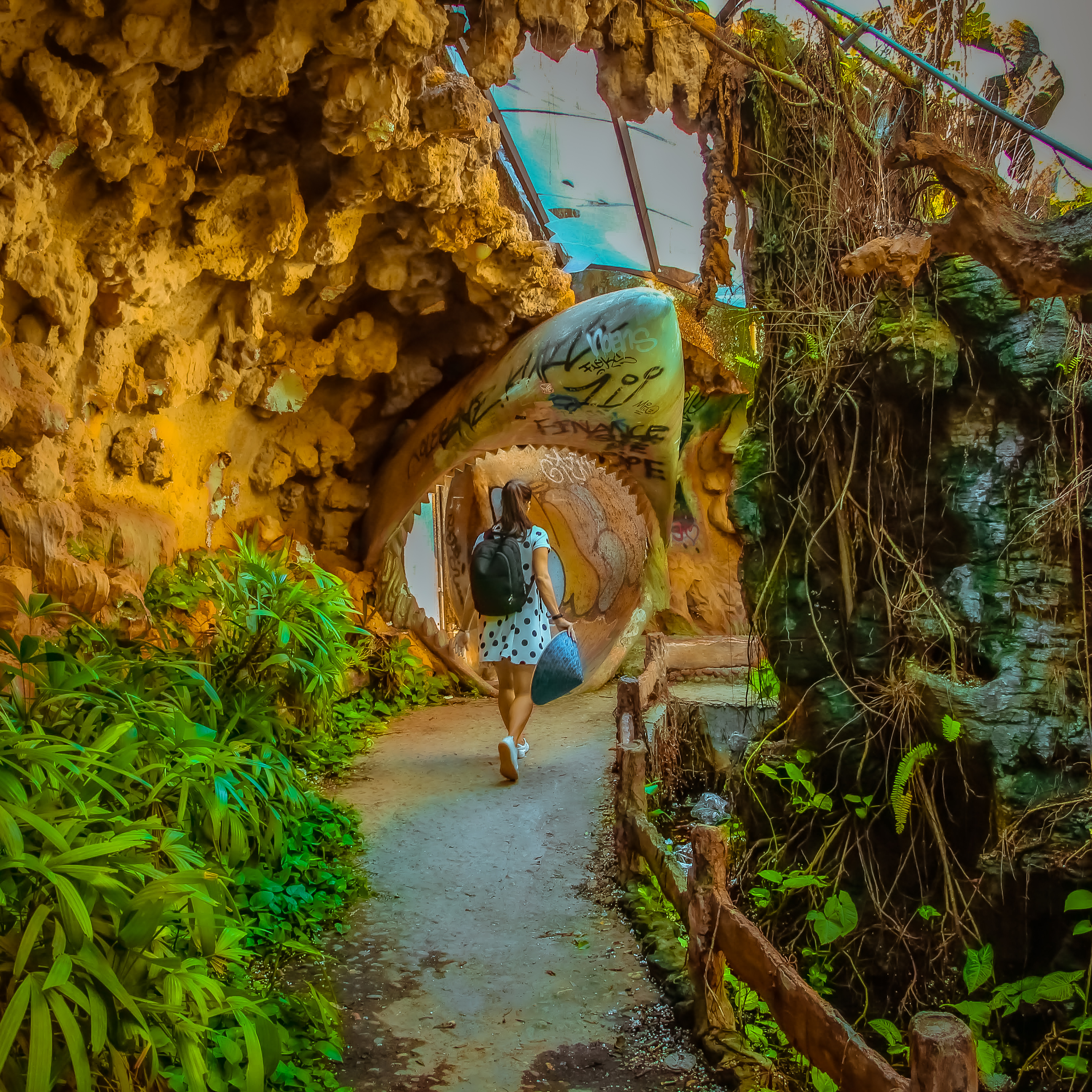
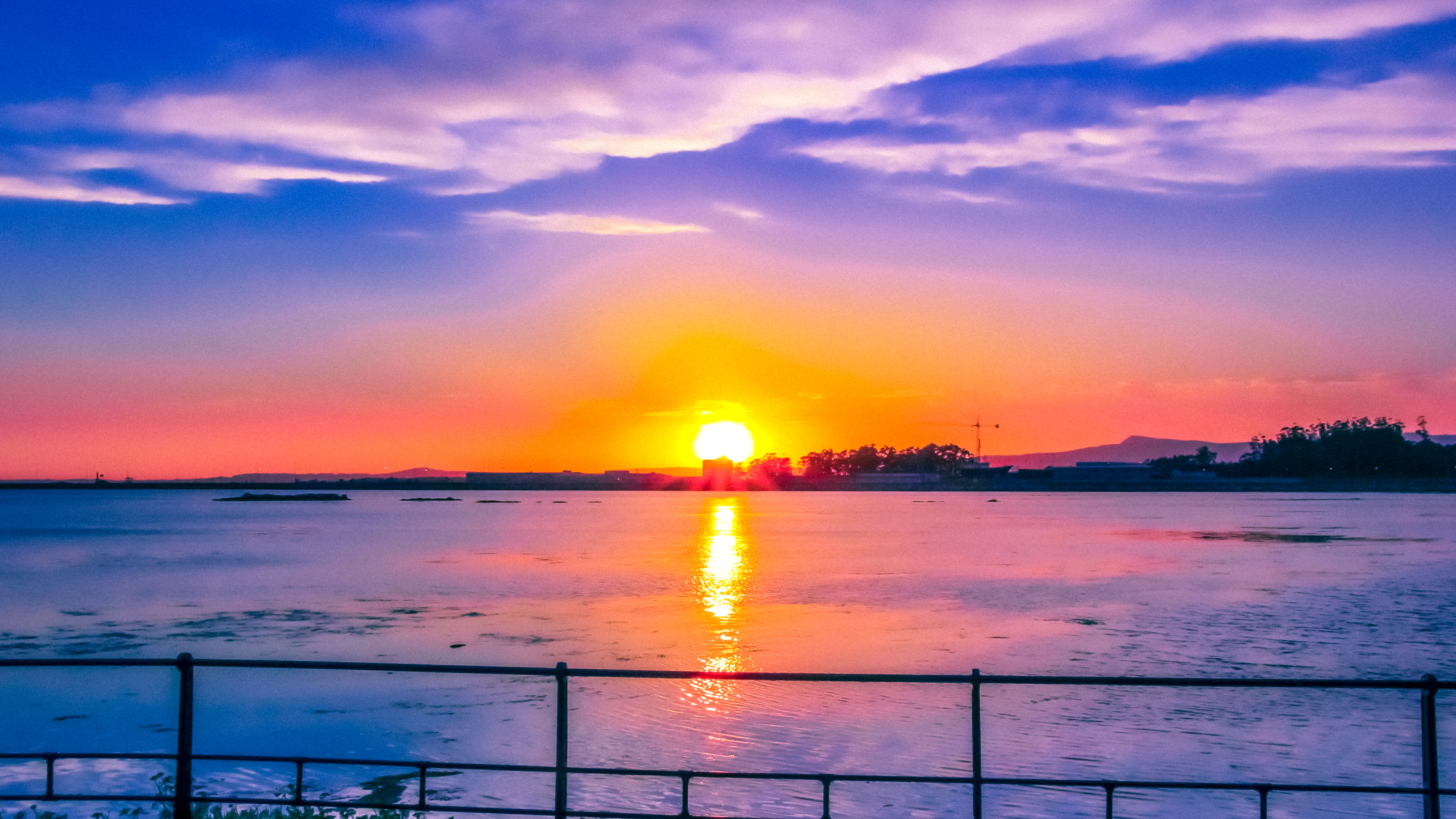
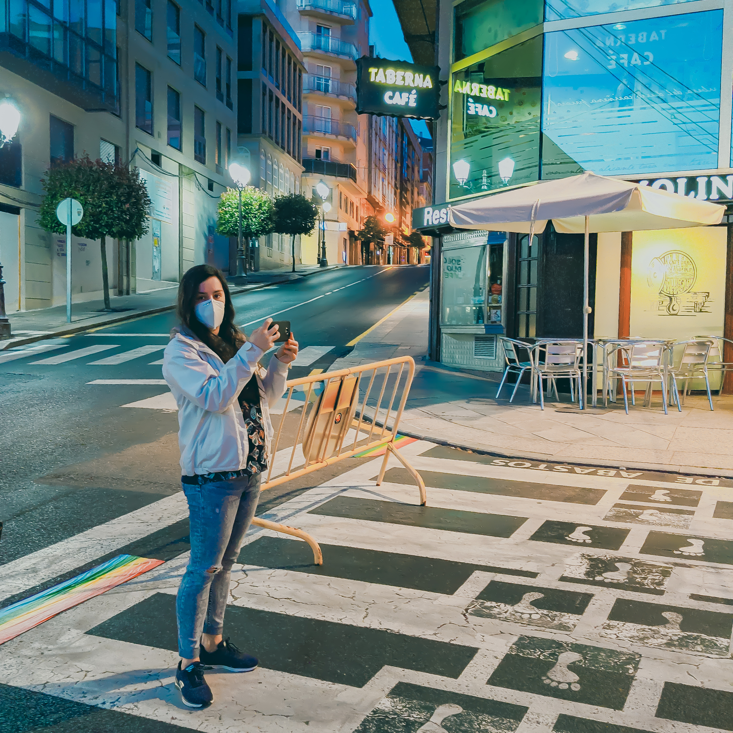
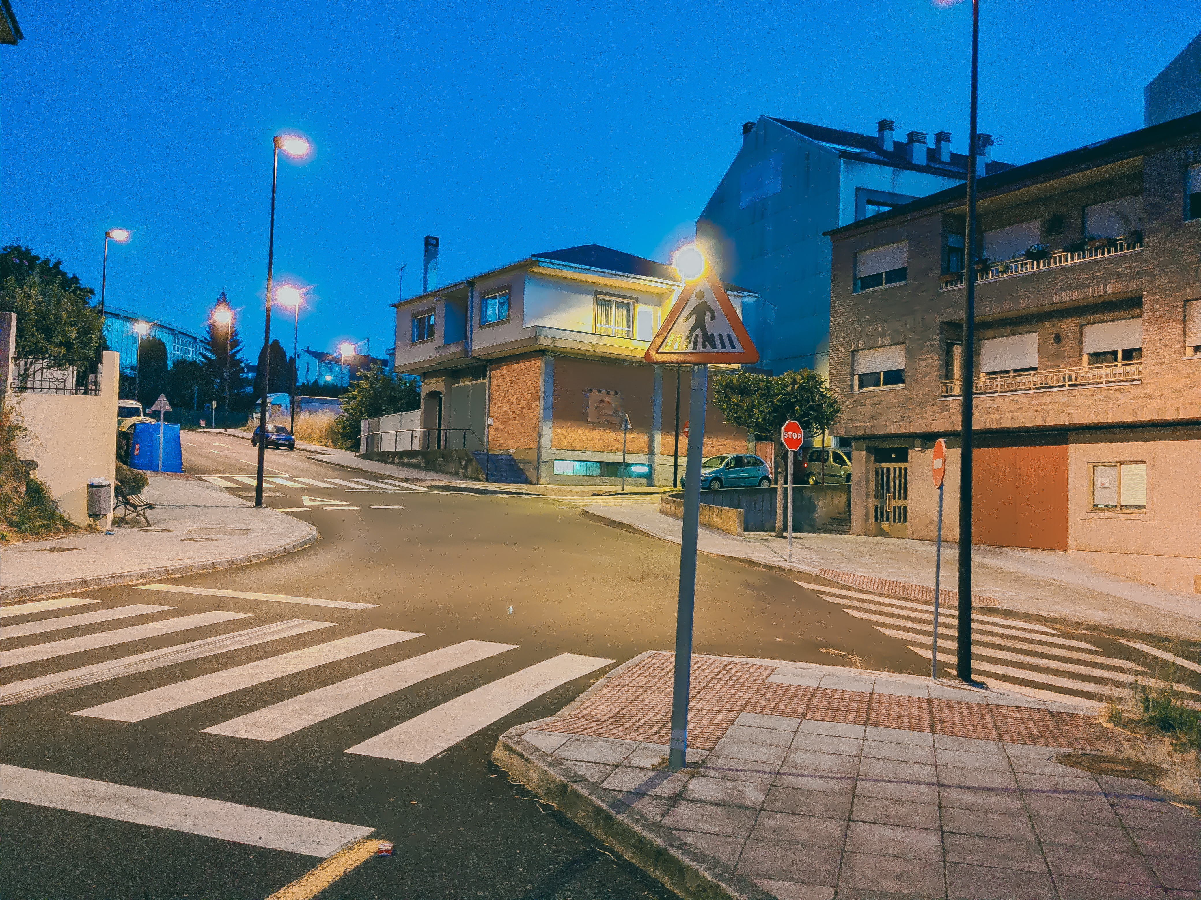
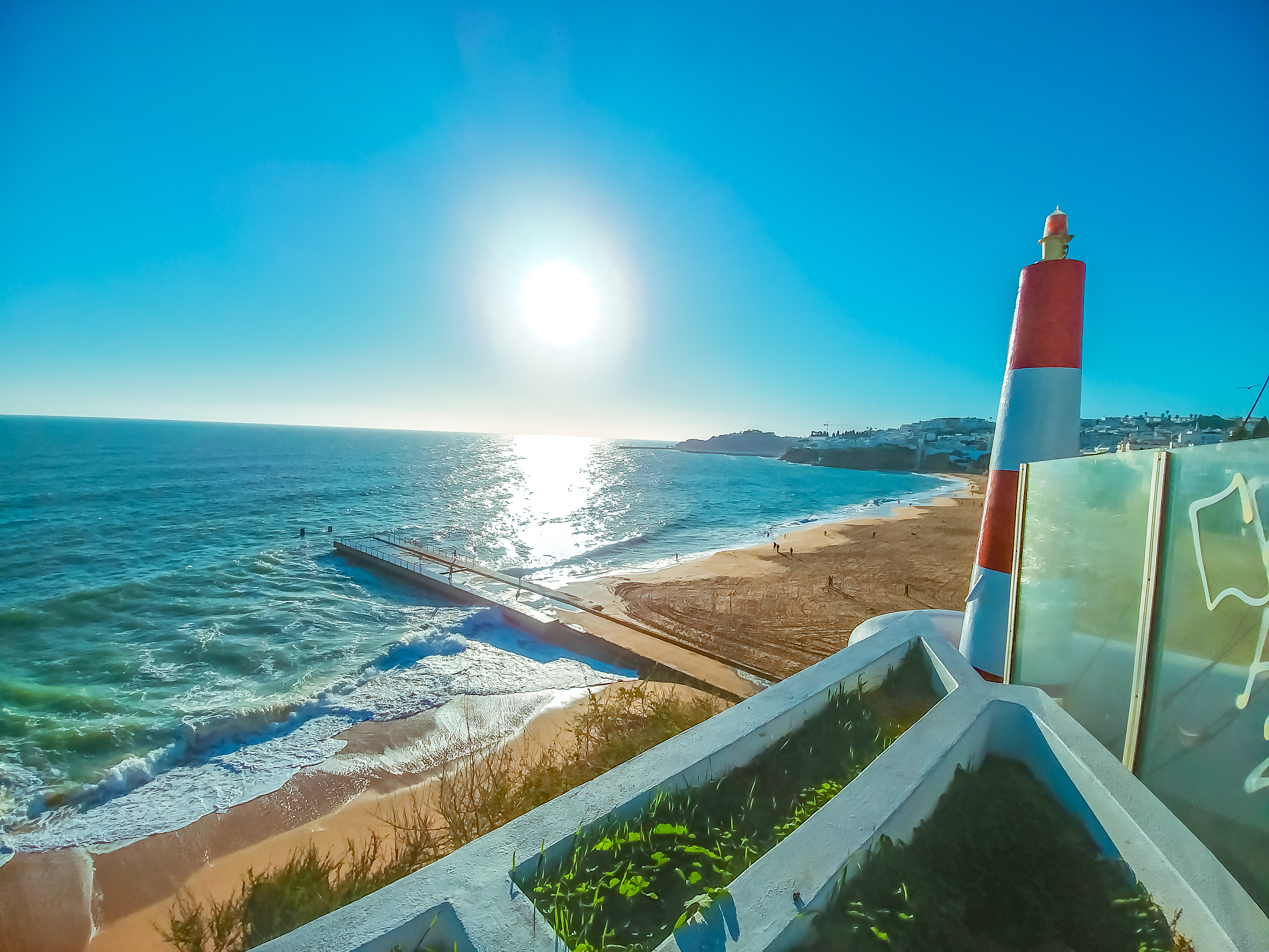
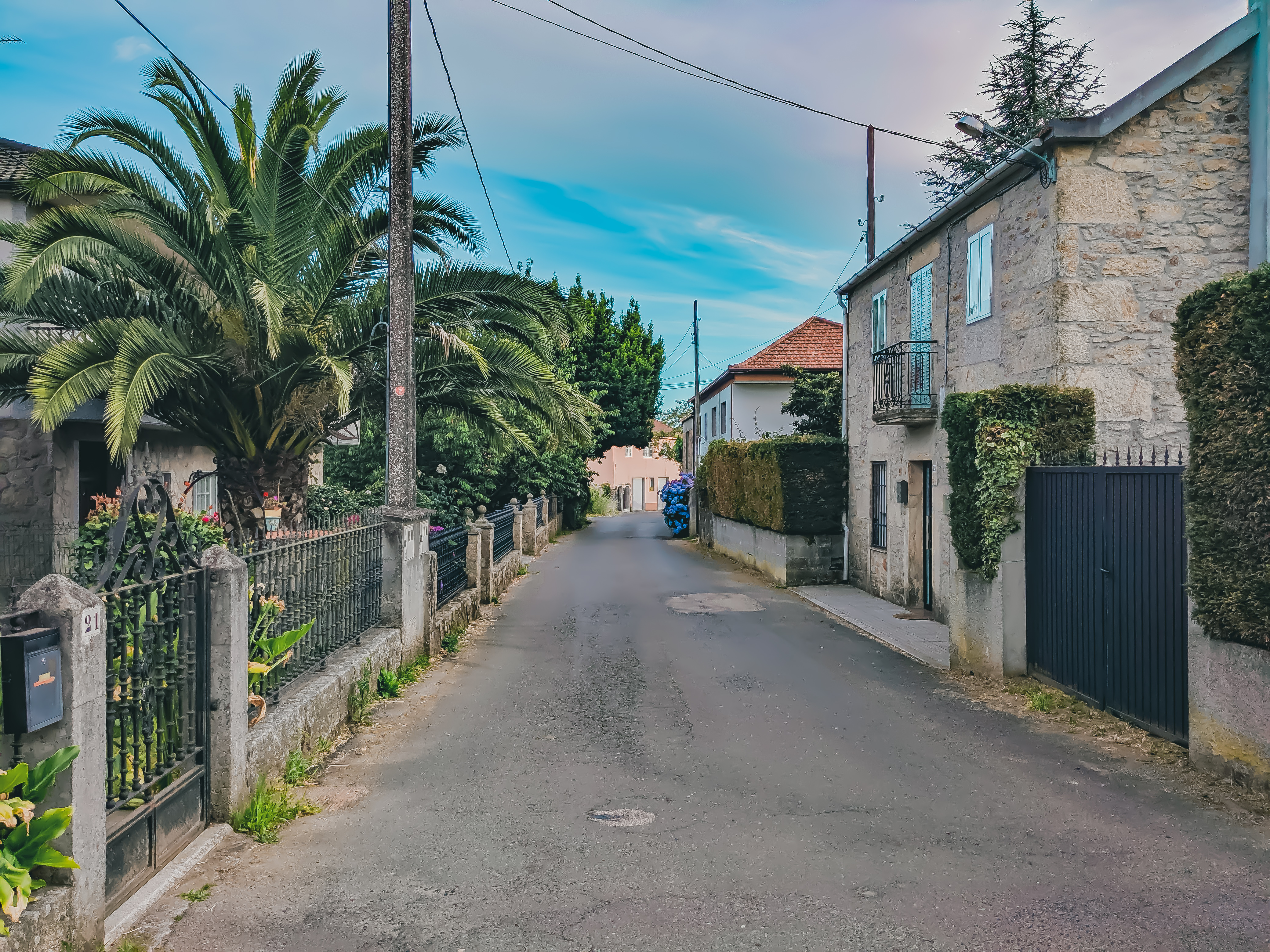
Because of this, something I’ve been toying with in the last couple of months, is how powerful Lightroom’s colour grading is, especially when you couple that with trying to recreate this animated/painted look.
The exercise itself involves bringing out the shadows, and knocking back the highlights as far as possible. This is because true blacks don’t often exist in these background pieces unless it’s night, meaning you get to see a lot more details in the shadows.
There’s also a bit playing around with the specific types of colours used, the general colour cast of the scene, adding noise reduction, grain etc.
All in all, I think some work better than others, and it’s definitely a case that I’ll think I’ll carry on experimenting with.